
NOTE (2023) Workload is just way too high lately - Not doing QSL designs currently. I hope things slow down enough to get back into it soon!
You can only get “Hey - where’d you get your cards done?” so many times before you figure that it might be a decent idea to offer it up as a service. Some people grew up in a “ham family” (Hamily?), I grew up in a graphic design and printing / publishing family. Mom & dad both did it most of their lives professionally, big brother is still at it (40+ years), I used to do a decent amount of album cover design and graphics & layout for a few magazines back in the day. And web sites… Ugh… Plenty of web sites.
Although I don’t really do it professionally anymore, I still do most of my own for whatever reasons and still lend a hand on a project here and there. With my introduction into ham radio and QSL cards, I wanted to make a “2k friendly” design that I could use for myself — It consists of a full-photo and full-info front side and a fairly plain back (it’s really just for notes and a return address). The reason for the full-info front was so that it could also be used “virtually” — I saved it as a PDF file and (easy to do on a Mac and at least possible to do on a PC) added editable form fields so that I could fill it out and export as a JPG, then send off to the recipient.
That’s the “template” that I typically start with — Yes, it differs from many “traditional” designs where the front is simply an image and the back contains the QSO information. But for the reasons stated above, it just seems to make sense.
Keep in mind that I’m NOT into a lot of crazy custom design work and I’m NOT “full-service” — I don’t do the printing. I just do the design and send it off to you (digitally) ready for print. I’ll export a PDF that you can use for one-offs if you’re not going to have them printed traditionally, along with PNG files of the front and rear if you decide to go to press.
The print specs and sizes that I use conform to Cards and Banners Printing — I’ve used them several times with excellent results. Excellent pricing, great customer service, inexpensive upgrades (16pt stock glossy front for instance). And one of few places that offer the traditional 3.5 x 5.5 QSL card size as a standard available size.
Long story short — If you have a photo of something that means something to you that you’d like to use as a QSL card, I can probably turn it into one. Let me know what you need and we’ll work something out. Design work starts at $50 (USD) if it can fit into the sort of “templates” shown below. I hate using that word as it makes things sound very “cookie-cutter” — But what I mean is, you have (obviously) your call sign, QTH (many don’t want street addresses on the front but might want it on the back), a block for information, the usual “please and thanks” along with a few logos or badges or what not. Where those items are laid out is usually dictated by the background image. And background images are usually modified in some way or another if they’re “plain” to begin with. Not just for artistic reasons (although that’s a good enough reason in many cases), but generally to make the text areas easier to read.
This page is pretty fresh and will undoubtedly go through several changes in the near future.
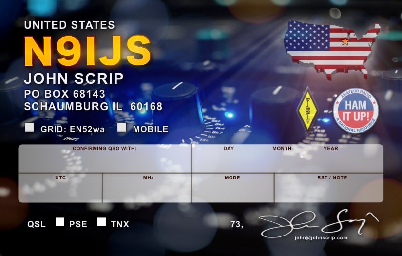
This one was based on my first QSL design. I’m an audio engineer by trade and always loved this shot that I took of my main equalizer. Although I don’t use this one anymore, I thought I’d throw it in to show what a difference just changing the background photo can make. My newer design (below) is almost exactly the same (pixel for pixel) except for that background image.
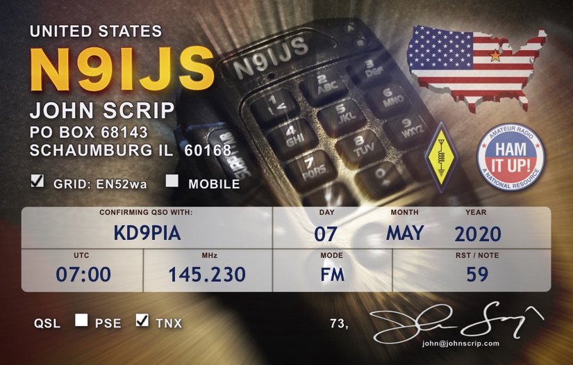
This is my current design (as of September, 2020). Just changed the background to my (578) microphone. Did some layering and blur effects to make the sharp-edged text “float above” that background better. This card is also in “digital” PDF form where I can fill in the fields and export as a JPG to e-mail or post to the recipient on social media or what not. Incredibly handy.
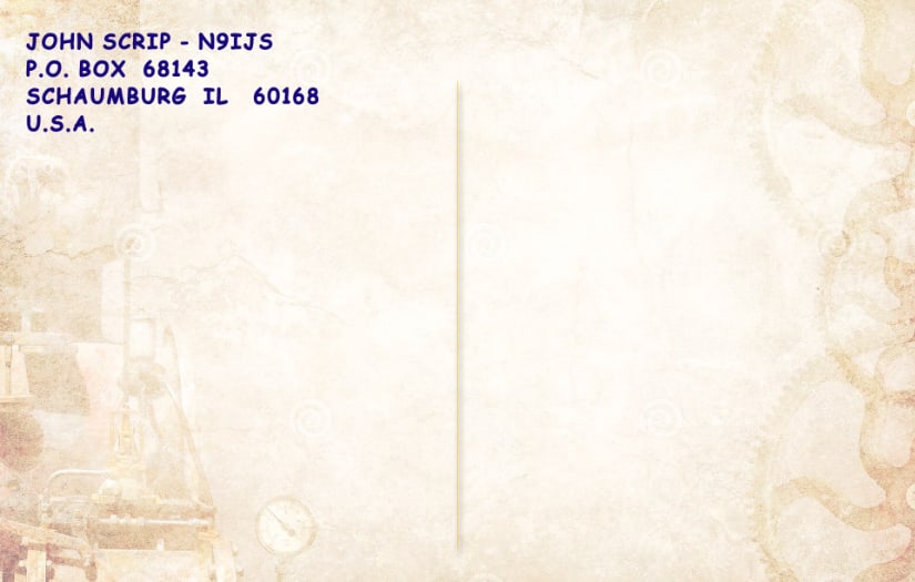
Rear of same card. Just a simple, full-color (but very much shifted to nearly sepia-tone) steampunk-is background, a return address and a divider. Plenty of room for a quick note and postage.
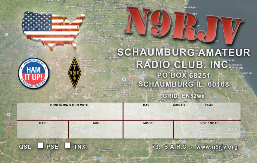
Club card - Simple “satellite image” background. Digital (PDF export) only format for this card that might get sent to new hams that check in on one of the clubs weekly nets as a “welcome” token.
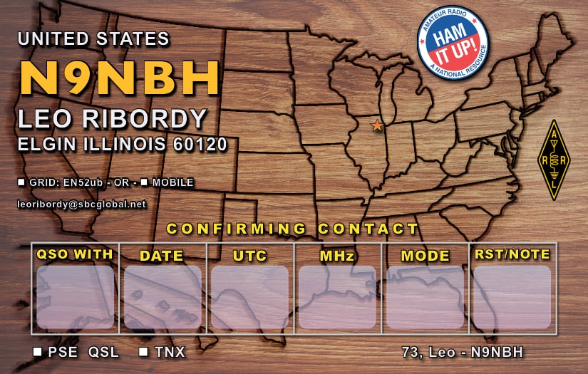
Leo is into woodworking. Enough said.
I should note that I don’t use this type of info block much anymore. It works well for digital exports, but I find it difficult to write in those smaller blocks. The two-level QSO block on the other designs just seems universally “friendlier” for writing on - and arguably easier on the eyes even for digital exporting.
I try to include a map and location indicator if you couldn’t notice. So this one was easy. ;-)
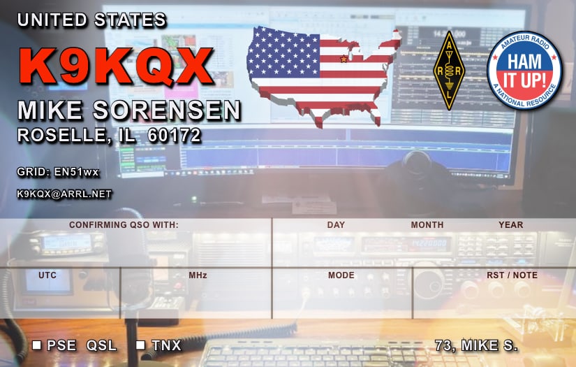
Mike wanted a card that he could print as needed from a photo print service (such as Walgreens).
The photo was a simple shack-shot lifted from his QRZ page. Resolution would’ve been an issue - But as mentioned, the shot was modified to actually make it *less* sharp so that the text would contrast the background.
The photo was a simple shack-shot lifted from his QRZ page. Resolution would’ve been an issue - But as mentioned, the shot was modified to actually make it *less* sharp so that the text would contrast the background.